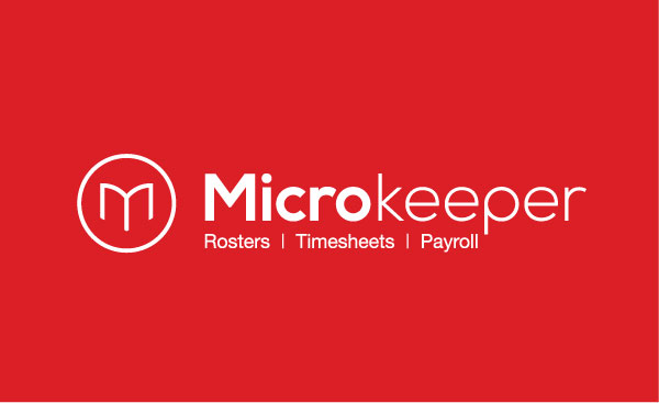
We are excited to announce the launch of our branding refresh.
Geelong based design agency Brown Ink took up the task of transforming our tired logo into a fresh modernized visual identity. The changes move the brand forward whilst remaining true to our founding principles.
The new branding reflects the expansion and development Microkeeper has undergone in the last couple of years, establishing its place as a leader in its field of roster, timesheet and payroll software.
Company director, Joel Davis explains "We're very pleased with the result. It remains true to our original identity whilst reflecting the growth of our business and the forward thinking nature of our service as a technology provider. It's an exciting time here at Microkeeper, as we're constantly evolving and pushing our technology, and our new logo confidently expresses that to our customers."
The changes can most notably be seen on our website with updated logo, imagery and graphics. Social media platforms Facebook, Instagram and LinkedIn, vital communication tools with our customers, will also adopt the facelift. Still in the works is our phone app, which will undergo the changes shortly.
Clean, simple shapes and lines make up the new logo. Whilst our icon remains a bold M, it's a refined form with an added visual reference to an open book. The use of a modern clean typeface and bold colour scheme compliment the new iconography. Sticking with our original core colours helps with the transition process with those already familiar with the brand.
It's important to note that whilst Microkeeper has become easier on the eye, it remains just as easy to use as the changes don't affect the functionality of our services.
We have already recieved alot of great feedback from the changes, and are looking forward to hearing more. If you have any questions comments or feedback don't hesitate to contact our team.


.jpg)