Guide for Creating Guides
Guides and documentation help put useful information into a readers head. This guide will help teach MK staff on how to create guides and allow us to stick to a consistent format when creating guides and FAQs.
Always start a guide with a H1 Heading. Follow the H1 heading with a concise introduction (2-3 sentences) explaining the purpose of the guide and its importance.
Navigate
Menu > More > Guides
Provide the exact menu path to access the module, formatted as a H2 "Navigate" section when applicable.
How are Guides Structured?
Use a H2 for all subheadings and H3 for third layer subheading to describe the section's purpose
A sections content can contain:
- Clear, step-by-step instructions on how to use specific features.
- Explanations of key concepts or terms.
- Tips or best practices for using the feature effectively.
- Cross-referencing related features or modules with links to relevant content.
- Visual aids can be used to help illustrate steps or concepts. See the Images section of the guide for more details.
Menu Navigation
Navigation to areas of the setting should be clear. Use ">" and bold text to help direct the user. Use this format to display menu navigation:
Section has a <h2>Navigate</h2> subheading:
Menu > Settings > General > Global
Section does not have a Navigate subheading:
Navigate to Menu > Settings > General > Global
If referencing a nested sub section:
Navigate to Menu > Settings > General > Global > System Settings - Business Name
Navigate to Menu > Settings > Employees > click Edit for the Employee > Employee Profile, under Entitlements - Entitled Annual Leave
Horizontal Lines
Horizontal Lines are used to separate major sections.
Before each <h2>sub-heading</h2>, a horizontal line should exist to separate the new area from the previous.
For example:
<h2>First area's heading</h2>
<p>First area's content</p>
<h3> First area's subheading </h3>
<p> First area's sub content <p>

<hr>

<h2>Second area's heading</h2>
<p>Second area's content</p>

<hr>
continue content
Images
Images require the most amount of attention, be diligent when uploading images.
Make sure the images show good mock data with realistic names.
Extensions
| PNG | Should be used for simple graphics where high contrast is present, eg. screenshots. |
| JPG | Should be used for photography. |
| GIF | Should be used for motion, rarely required for guides. |
| SVG | Should be used for basic vector art like a logo |
Width
Make the image as narrow as possible, 300px is the goal width, 600px is still good, anything bigger will become unreadable on mobile.
Tricks that can be used to achieve this:
- Make the browser window smaller
- Edit the screenshot in eg. paint, figma
- Cut off irrelevant information
Make sure browser zoom is set to 100%, this makes screenshots consistent across guides.
Image name
The file name should be SEO friendly, for example, "microkeeper-login-page.png"
Only use lower case and dashed, nothing else.
Formatting
After an image is uploaded:
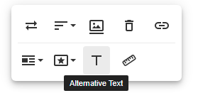
Assign the ALT attribute, this should be SEO friendly, describe the image, eg. How to edit the Alternative Text field on a image:

Make image left aligned.
Removed the width, this forces the browser to use the actual image width, up to screen width of 100% for mobile, which is coded into the CSS.
Deleting an Image
To delete the image click the trash can, the image is permanently removed from the servers.
Undo, will not restore the image, the image must be uploaded again.
When Cutting and Pasting the image you will be prompted to delete the image:

Click Cancel if you intent to Paste the image elsewhere.
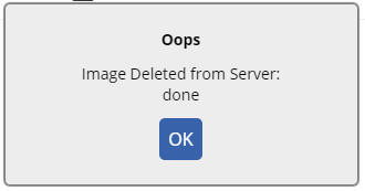
To help, there is a message displayed when an image has been permanently deleted:

Double Checking Images
The browser/cloudflare will cache the image, so even though it has been deleted it will still load, the only way to check this is to load the guide from incognito on another server.
Add syd. bri. or mel. in front of microkeeper in the URL.
Ideally this should be done just once, at the end of the editing session, or else cloudflare will cache the image from the alternative subdomain too.
Links
Always use the open in new tab option, when linking the reader elsewhere.
Never link a whole paragraph, only link a word or two.
Bad
Did you know a Peacock refers to a male Peafowl.
Good
Did you know a Peacock refers to a male Peafowl.
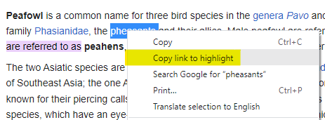
Use the Copy Link to highlight feature when possible:

Language and Formatting of Guides
Emphasising and Highlighting text
When to use bold verses "quotes"
When drawing the use to a particular feature use bold.
When instructing the user to enter text, use quotes.
For example
Enter "John Smith" for the Title.
It's acceptable to use neither:
Go to Menu > Settings > General > Global
Formatting Guide Content
Use clever HTML to break up huge slabs of text.
Example
- A
- Few
- Dot
- Points
Or maybe
| Even | A | Table |
| When | Deemed | Appropriate |
(But not like this ^)
Or maybe steps:
- If a particular
- Order should
- Be followed
- Keep sentences short and to the point
- Avoid using words like:
- it
- you
- just
See this guide on Words for more detail.
Intended Audience
It's best not to assume the audience, a manage/admin/accountant could be reading this on behalf of someone else.
For example;
Bad:
You should enter it into the box.
Good:
Enter the username into the box.
Capitalisation guidelines
Proper Nouns and Named Features
- Capitalize specific names of products, modules, or features.
- Example: "Open the Jobs module to manage employee tasks."
Common Nouns and General Concepts
- Use lowercase for general references or common nouns.
- Example: "Create a new job within the Jobs module."
UI Elements
- Capitalize names of buttons, menu items, and other UI elements exactly as they appear in the interface.
- Example: "Click the 'Add New Job' button to create a job."
When to use bold verses "quotes"
When drawing the use to a particular feature use bold.
When instructing the user to enter text, use "quotes". For example:
Enter "John Smith" for the Title.
It's acceptable to use neither:
Go to Menu > Settings > General > Global
Tables
Table Borders
Table Style -> Table Border Light, displays the border lines which increases readability.

Table Cell Background
Use Cell Backgrounds for tables with lots of data.
| The Header should be #B6D8E5 |
| Odd columns should be #FFFFFF |
| Even columns should be #EFEFEF |
| This helps improve |
| the readability of data |
Using Example Blocks
An example block can be used to provide an illustrative example to help clarify a concept or instruction.
An example is contained in a <blockquote> tag and displayed as italics text with purple text colour.
Pasting content from Word
Do not paste directly from word.
Copy the text to notepad, which will remove all the formatting then paste the content.
The formatting should be done in the HTML editor.
Example HTML pasted from word:
<ul style="margin:8px Opx 4px;color:rgb(0,0,0);fons-family:sarial, helvetica, serif;font-size:l5px; font normal; font-weight:400;
lecter-spacing:normal; texs-align:left;text-indent:Opx;texs-trans:forminone;white-space:normal;word-spacing: Opx;background-color:rgb(255,255,255); padding: 0px Opx Opx 40px;line-height:1l7px;"3>
Same HTML pasted from notepad:
<ul>
This keep the HTML small and makes sure our style guide is applied rather than Words.
When to use bold verses "quotes"
When drawing the use to a particular feature use bold.
When instructing the user to enter text, use quotes.
For example
Enter "John Smith" for the Title.
It's acceptable to use neither:
Go to Menu > Settings > General > Global
These are guidelines, there are definitely exception to the rules. Documentation is an exercise in empathy, put yourself in the reader's shoes and create accordingly.
We want to maintain these guide goals:
- Consistency across all guides
- Mobile friendly
- Screenshots to scale and be clean and clear
- Brief as possible and to the point
- Linking to other guides or external resource